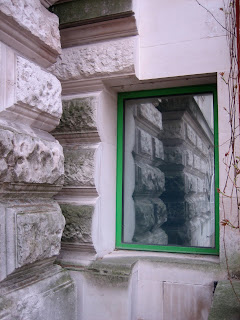
Appropriately enough, the current exhibition of James Stirling's archive (see last post) is housed in the extension that Stirling designed for Tate Britain in the mid 1980's. This is a building that epitomises the problem Stirling poses for many architecture critics who struggle to reconcile their enthusiasm for his early buildings with his lurch towards Post Modernism in the 1970's. Many of the visual tropes employed by him here - primary shapes, loggias, vaguely classical forms, lurid green windows - all became screaming cliches of Po Mo, appearing on all sorts of truly terrible buildings in the same way that the bar-code facade does today.
The exterior of the Tate extension is an odd thing to be sure. The shallow pond that used to sit in front of it has been removed, making the timber loggia oddly disembodied and slightly pointless. I always found this element difficult to gauge though, its chunky timbers decidedly lacking in visual wit or flair.
The exterior is a collage of materials that relate - in a diagrammatically very literal way - to the buildings around it. This is post modernism's contextualism taken to a neurotic level. The idea that a building should mutate to reflect the materials, forms and scales of those around it is here turned into an arcane parlour game that should - but doesn't - result in the complete dissilution of the contemporary building. It is a kind of mirror in fact but one that provides a very distorted reflection of the buildings around it.
An interview between Charles Jencks and Stirling about the Clore once appeared in Private Eye's Pseuds Corner. The section in question went something like this: Charles Jencks; "Looking around the Clore I counted some sixteen different contextualisms". James Stirling: "I would hope that there were more than that". Which is funny on at least, oh, sixteen different levels.
The fact that the building is anything but contextual isn't really a problem. An obsession with 'fitting-in' bedevils architecture and ignores the reality of cities with their mix of styles and scales. At the Tate, flagrantly out of place elements, like the previously mentioned green windows and industrial objects, pop up all over, precisely to make clear the bogosity of all that stone cladding. The building thus managed to please no one when it opened - neither conservationists, classicists nor modernists - which is possibly its greatest virtue. 'Round the back it all gets - a la Robert Venturi - very plain with beige engineering brick and some pseudo industrial detailing. This has echoes of Stirling's more hi-tech past as well as referring to the pop coloured boiler flues of Richard Rogers. I was impressed by the colour coordinated hosepipes though.
It is the interior and, specifically, the entrance sequence that provides the real drama though. This is one of those fabulous Stirling promenade architecturales, a sequence of stair, mezzanine and walkway which seem to propel the visitor through space. Fragments of architecture - Corbusian spiral stair, John Soane archway, Aalto-esque staircase - appear like archaeological fragments along this route. The plan is Beaux-Arts classicism inflected by modernist spatial tricks, a small-scale interior version of the elaborate circulation system found in Stirling's Staatsgalerie in Stuttgart.
This space was dismissed as "shrilly amusing" by John Allan in his somewhat fogeyish review of Stirling's exhibition. The supposedly "adolescent" colours are vital of course, just on the right side of revolting and helping to keep the whole thing oscillating on the edge of good taste/bad taste. I agree that the galleries themselves are a bit dull though, neither being a full-on historicist theatre-set like VSBA's Sainsbury Wing, or jarringly modernist as one might expect from Stirling.

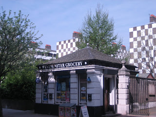
Just around the corner from the Tate is a bizarre, late '30's social housing scheme by Edwin Lutyens*. Amazingly given both how many times I have visited Tate Britain over the years and the fact that I'm a big Lutyens fan, I had never visited his Grosvenor Estate housing before. It doesn't feature in many (any?) books on Lutyens either, partly because it is so untypical of his work.
In a way, the Grosvenor Estate is a subtle reversal of Lutyen's normal work. His houses tended to take an ostensibly traditional form - Sussex manor house, classical villa etc. - but twisted them into forcefully sculptural and geometric forms. Unexpected collisions, spatial contradictions and formal juxtaposition subvert the solid references, without actually entirely overwhelming them. At Page Street the reverse happens. An essentially modernist typology - the zeilenbau housing block - becomes inflected by classical and Beaux-Art elements.
The most striking of these elements is the chequerboard patterning, a fragment of medieval or Gothic decoration blown up to enormous and highly graphic proportions. This device actually prefigures any number of much more recent housing blocks covered in gratuitous pattern or large scale decoration to relieve the tedium of repetitive units, including, most obviously, AHMM's Dalston Lane scheme. Lutyens' pattern is more subtle than might first appear though. It can be seen either as applied pattern or as absence. The white squares of stucco applied to the brickwork reveal the method of the building's construction and make an oblique comment on the supposed poshness of stucco over brick facades.

The flats are arranged in a series of U-Shaped blocks that create courtyard entrance areas. These are very nice spaces, beautifully kept and - on the sunny afternoon that I visited - very well used. Around the courtyards run open access decks - the sort of simple and efficient circulation system used extensively at the time but now pretty much verboten for reasons to do with both snobbism (its considered a bit infra-dig) and paranoia (they wouldn't get past Secured by Design).

The columns to the open, courtyard elevations form both a colonnade at ground level - affording a level of privacy or bounded space to the ground floor flats - and a variegated rhythm at higher levels. From the courtyards the blocks manage to be both visually dynamic and spatially intimate - a neat trick.

The pattern also gives the blocks a very odd, ambiguous scale, both big and small at the same time. As Owen observes, they come from the same playfully surreal late Victorian/Edwardian sensibility evident in Peter Pan and Alice in Wonderland. That a large scale, high density housing scheme could conjure up such whimsical references is in itself pretty remarkable.

Both Stirling's gallery and Lutyens' housing can be seen as peculiarly British in character, full of witticisms and whimsical details that negotiate the complexities and contradictions of their location and brief. This is not wholly a compliment though in that both can be seen to resist the full implications of modernism choosing messy compromise over revolutionary zeal. But both are also saved by a lack of restraint, or to much good manners. Stirling's eye-watering colours, intellectual references and chutzpah and Lutyen's audacious wallpapering of a whole district mean that they avoid being merely charming. They also bookend modernism to some extent, two buildings at either end of the modernist timeline. Of the two though, Lutyens' building seems to offer the most in that he solves a still modern, contemporary typology brilliantly.
* Owen Hatherley recently wrote about this on his Urban Trawl blog too. Apologies to him, you and anyone else for any similarities in either the form or content of this post. It's coincidental.


2 comments:
The Grosvenor Estate looks very cosy inside - though when I used to walk past them on the way to work the chequerboard pattern always made me think of a prison.
It's on the edge of being whimsically charming and slightly sinister. Which gets to the heart of that English surrealism thing. I would love to go inside - maybe it will be in Open House one of these days.
Post a Comment