Showing posts with label Architecture.. Show all posts

Thursday, May 13, 2010

Essex Links


One silver lining of the election - along, perhaps, with the success of Caroline Lucas, Green MP for Brighton Pavilion - was the routing of Nick Griffin and the BNP at Barking. I'd been conscious of the possibility of the BNP winning the seat when I was writing my last post partially extolling the merits of that part of the world and was consequently a little wary. Barking isn't strictly speaking in Essex, but its roots certainly are. Anyway, with the vindication of the people of Barking and Dagenham demonstrating their innate decency, I can now recommend some further reading on the subject.

Firstly, Mondoadogo makes a coincidental visit to Canvey Island (please forgive the plug back here early on, that wasn't my motive in linking to Mondo's post) and takes some very nice pictures along the way and, secondly, Caught By The River has a long photo essay on the glories of the Essex coast, which begins at Canvey. Go read.

Tuesday, April 27, 2010

Leaving New Haven


This is the 3rd, and most definitely final, post on New Haven. There's a few buildings I wanted to see and didn't, for various reasons, including Rudolf's Crawford Manor and the interior of the Sterling Library, so I might still get a chance to post about them individually. The picture above is of the Prague subway-ish foot tunnel below New Haven train station.

I bought a guide book this time too in a bid to avoid embarrassing displays of architectural ignorance, so expect clunking pieces of factual information strewn amidst the usual flippant nonsense.


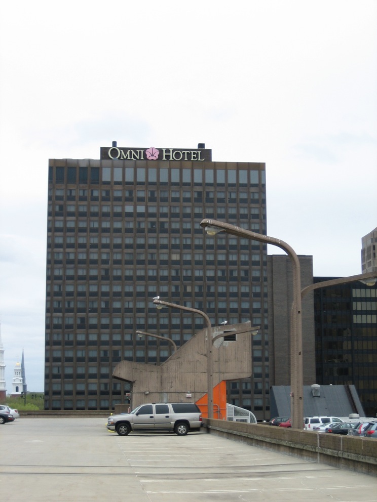
I'll start here with the view from my hotel room window of Rudolph's Temple Street Parking Garage (completed 1961, capacity 1280 cars), mentioned before and included again because it's the first time I've really been able to convey the vast scale of the building. The other thing evident in this shot is the fabulous roof-scape of miniature buildings and concrete lamp posts that look like wilting flowers, of which more later.


A photo essay of New Haven wouldn't be complete without a visit to VSBA's Dixwell Fire Station. This is officially the first ever building with a 'peeled-off corner', a device which became a cliche of Post Modernism but had one of those curiously Venturian justifications here. It's 'required' in order to get the overscaled lettering to fit the facade facing the main street, although it's clearly the case that the text was strategically sized in order to make this circumstantial gesture necessary.


One thing that puzzles people about Venturi and Scott Brown's buildings is that they really are quite ordinary. Viewed in architecture books hey have a kind of residual glamour, but seen in context they are completely at home and, almost, unremarkable. This is meant as a compliment. There is a subtlety and 'rightness' to their proportions though, even when they are deliberately wrong, that gives them a tension with their surroundings. Even so, if you spend too much time staring at this building people tend to come up to you and ask if you're lost. Or if your house is on fire.


There's also some nice low key topiary going on around the edge, and you can't say that about the Barcelona Pavilion.


Nearby is this bizarre thing, a power station built to fit in to a Greek Revival style neighbourhood now entirely demolished. In Europe, and particularly in the UK, industrial buildings from the 19th and very early 20th centuries were routinely disguised as castles and temples. This is part of the same tradition, I suppose, although it is somehow less romantic about its artifice. Unfortunately smoke doesn't emit from the twin spires although it may have once.


On the subject of artifice, I have said relatively little about the older campus buildings. They are, in parts, deeply strange, as bizarre as anything dreamt up by Anton Faust or other plunderers of the gothic. But, despite their artifice in recreating a new super-sized version of Oxbridge, you get used to them remarkably quickly.


Take a second look at this and it's actually pretty bizarre. It's also strangely plausible. Unusually too for an American city - save New York - the central campus areas of New Haven are essentially pedestrian. Between the blocks carved out by roads, the colleges unfold as a series of interlinked courts.


I'd say that the urban morphology of the campus was highly permeable if it wasn't for the fact that I would have to kill myself afterwards.


Many of the more contemporary buildings tend to ignore such picturesque niceties. Marcel Breuer's Bekton lab, for instance, sits aloof on it's own raised plaza and refuses to pass the port in the right direction.


The back of it is almost completely windowless too, making the building a scaleless, abstract object like a bit of detailing or piece of fabric pattern, blown up to a huge size.


Philip Johnson's Kline Laboratory building attempts a (broadly) modernist updating of the courtyard theme. Around the edge is a continuous colonnade that pulls together various disparate buildings into a formal whole. They sit at the top of a steep hill and this, combined with the slightly gargantuan scale, means the space has the feel of a corporate plaza rather than an informal college courtyard.


It has an odd effect too on the other buildings, suggesting that they all sit on the fat brick piloti that support the concrete awning.


The laboratory tower itself is reminiscent of Michael Graves' (much) later buildings with its chunky stripped-classical columns and slit like windows. It lies at the queasy intersection between a De Chiroco-esque distilled evocation of the classical city and bombastic neo-fascism.


Inside it's pretty grim, although not totally awful. The library is given the best space, sunk into the podium at the bottom of a double height atrium and crossed by bridges. Despite this the whole place has the air of a particularly cruel penitentiary.


Johnson's tower is oddly off axis with Hillhouse Avenue, the street running up to the mound on which it stands. From a distance it appears to be hiding, slightly bashfully, off centre-stage.


A view of Michael Hopkins' newly opened Kroon Forestry Studies building. Like a lot of Hopkins' recent projects (see Portcullis House) it has an overall weirdness which can't be contained by the Anglo Saxon rectitude of the detailing. On the outside it is clad in a skin of very new looking sandstone that is pulled away from the facade in order to make a colonnade but also to articulate - in the accepted manner - that it is not actually holding anything up. This gives the windows a voided look too in keeping with Hopkins recent goth tendencies.


Occasionally he has peeled away the stone cladding in a mock-ruinous manner in order to further reveal the artifice of the construction. He's obviously been listening to a lot of Sisters of Mercy.


Inside it is part high-tech and part Arts and Crafts with nods to the heroic Yale campus buildings of the '50's and '60's. The fare-faced concrete and fine honed timber is indebted to Kahn's British Art Centre, but the building itself is like a huge barn, more greenfield campus than urban. This is also an unflattering photo of an interesting space and the vault at the top of the building is lovely.


The high-tech meets arts and crafts theme continues with the fetishisation of glulam technology and big bolts.


Just down the hill from both Johnson and Hopkins is SOM's former Watson Astronomy Centre building which sits enigmatically behind its ivy filled moat.


Sitting at the bottom of Hillhouse Avenue is the very bizarre Cloister Hall. There are many things to enjoy about this including the stone gable superimposed on the tile one behind and the vaguely grotesque bay window bursting like a malignant growth on the left hand side.


This is a remarkable object, a cartoon piece of classical whimsy where everything is a bit fatter and rounder than it needs to be, like a bouncy castle carved out of real stone. The dummy windows are highly embellished blanks while the real ones are more low-key and largely hidden by vegetation.


It also has some very strange asymmetrical columns adding to a general sense that it might be several buildings cut and put back together in the wrong order. Or a building that got dressed in the dark.


I like a Dutch gable. And some rustication. This has both and is by McKim, Mead and White. Architecture criticism doesn't get much more sophisticated than this.


Strange, heraldic brickwork, sometimes incorporating the word Yale covered this building....I've no idea what the other signs mean although they may be something to do with a secret society.


Speaking of which, I risked my life taking this shot. It's the mysterious Skull and Bones Secret Society "Tomb". I half expected Robert DeNiro to suddenly appear beside me a la The Good Shepherd and tap me up for CIA membership. The Skull and Bones is mostly the subject of amusement rather than awe at Yale, although it still has strong links to political power. Both Bush presidents were members, as was John Kerry and Obama's current economics advisor. The building is attributed to Henry Austin who added various other bits of neo-Egyptian architecture to the campus.


The Gordon Bunshaft designed Bienecke Rare Book library appears like a colossal but very un-aerodynamic spaceship that has just landed amidst Yale's neo-medieval campus.


The library is a windowless concrete framed casket where the marble infill panels are sliced so thinly that they let light through into the interior. It sits enigmatically in a granite plaza from which the building's columns seem to grow.


The soffit around the entrance is notably low and hangs slightly menacingly above your head as you enter.


The inside is very beautiful and has a misty quality reminiscent of Renaissance churches where the precise edges of the room are hard to make out. The strangely corporate furnishings though also give it the feel of a sensationally upmarket hotel lobby.


This it turns out is by Charles Moore, or at least the office of Moore and Turnbull. When it was completed the air-conditioning grills to each apartment were painted in different colours, although they have faded now leaving the building unremittingly grim. My guide book said something about the top row of windows forming a vestigial cornice, which is generous.


Across an asphalt car park from the Moore building is this somewhat creepily blank church with a roller shutter entrance door...


...guarded by someone in this little hut who's been using a lot of gas.


I took this shot for Lang Rabbie, who asked in a comment to a previous post whether Kevin Roche and John Dinkerloo's Yale Nursing School was still there. It is, although it appears to be sinking.


Back on the roof of Rudolf's car park I got very into the concrete folly-like service towers. The lean to greenhouse is new I assume but the bright mosaic tiles are original. The lamp posts are also very elegant, made as if from a thin strip of concrete that has been peeled apart like a banana...


The interior is fabulous vortex of clashing concrete decks and vaulted tunnels and an excellent location for a car chase.


The height of the roof is also almost exactly aligned with the various church steeples that sit along Temple Street (so called for that reason), giving them an odd, almost domestic quality when viewed so close up.


A seagull gazes mournfully out across New Haven towards the port and Marcel Breuer's vacant former Armstrong Rubber Company building stranded by the freeway. Next to it is a vast Ikea which sometimes uses Breuer's building as a billboard.


And finally, a shot back to the good old Omni Hotel. I shall miss its heavily patterned interior and scarily large apples in the lobby.

Sunday, October 11, 2009

Thinking It Over and Over


Things are likely to be a little quiet around these parts for a while as an onerous work load (oh poor old me) takes its toll. I will at some point pop up in various places writing on topics as varied as the return of James Wines to the architectural consciousness, the geography of heavy metal and why suburbia isn't funny anymore, but for the moment all I can do is point you in the direction of some good writing elsewhere.

Entschwindet und Vergeht is superb as usual on the uses and abuses of the Crystal Palace and yer Owen Hatherley is terrific on the joys of dancing to the digital angles of electroclash. Also, check out his link to an intriguing and (to me) unknown lost monument in the excellently titled Iron, Glass and Failure post.

Slightly redundantly I will echo Murphy's endorsement of the Sesquipedalist's excellent series of photo's of the ruins of Gillespie, Kidd and Coia's St Peter's Seminary. Mockitecture has a convincingly Venturian post on decorated Brutalism, as well as a fine collection of photos of Burger King's Whopper from around the world. And I've been enjoying this site a lot recently. It slightly does my head in visually, but has a fabulous collection of interior photos ranging from Sol Le Witt's house to a collection of empty and desolately beautiful nightclub interiors, all velvet seats covered in cigarette burns and scuffed dancefloors.

The AOC have another new blog site for their latest teaching outpost, this year looking at the Thames Valley. I'll be spending a lot of time in the wilds of Kent myself, as the expansion of Lydd Airport into the otherwise silent marshes of Rainham is the setting for a project I'll be teaching at Canterbury architecture school this semester. In this - if not in all other senses - I'm not as glamorous as my colleague, who is teaching an Intermediate Unit at the AA this year entitled the Pop Vernacular Research Laboratory.

Also, when FAT make their much heralded return to Yale in the New Year, we will be bringing our students over to see the lovely East Kent coast (lucky them) where we will go on a booze cruise, draw sections through cross channel ferries, attempt to dissect the various dubious notions of Britishness bound up around the place and generally roll in the clover on the White Cliffs of Dover.

The photo at the top of this post shows the extraordinary infrastucture of Dover. Note the road into the harbour, which descends past Dover Castle before sweeping you over the edge of the cliff, around the town and down in a loop onto the bleak concrete forecourt of the terminal itself.

From there you can drive onto a boat full of nutters playing fruit machines on their way to France to buy inordinate quantities of cheap booze. Trundling the other way is an ever increasing number of container lorries full of washing machines, clothes and children's toys. Countless B&B's cater for asylum seekers and their tabloid mirror image, illegal immigrants. The town is a locus for national pride and - sorry to say - a bit of a shit hole. This is, in some senses, England.

Incidentally, while researching Dover I came across this.

(Image at the top of the post is via)

Saturday, February 28, 2009

The Odd Couple


British architecture throughout the 1980's was pretty much a straight fight between high-tech and postmodernism. Nicholas Grimshaw (High-Tech Athletic) and Terry Farrell (Po-Mo Allstars) were two of the architects slugging it out. Strangely enough though they had once been in partnership together. Their fifteen year collaboration (1965-1980) fell apart due to obvious stylistic differences but the fact that the two had worked together at all suggests an area of unlikely common ground. This offers a glimpse of another route that British architecture could have taken after the 1960's, one unfortunately snuffed out by the belligerent arguments of the time.

Grimshaw's refined industrial aesthetic and Farrell's postmodern eclecticism seem irreconcilable when viewed today. But Farrell's autobiography Place suggests areas where they came together. The most obvious of these was the idea of flexibility in buildings. This was a key concept coming out of the '60's when there was a fascination with temporary/lightweight structures, allied to non-hierarchical ideas of spatial and social organisation.

For Grimshaw, this meant buildings that were literally flexible; sophisticated mechanisms that could move and change over time. The Grimshaw camp within the partnership developed a sequence of supposedly repeatable and adaptable metal framed office buildings. Farrell's notion of flexibility was less aesthetically driven. He was interested in adaptable buildings too, but crucially it was the people and the function that could change, rather than the buildings themselves. For Farrell, this approach encompassed existing terrace houses and semi d's, as well as industrial lofts and old factory buildings. This idea of revitalising existing buildings through adaptive re-use led to Farrell becoming an early unlikely hero of the conservation movement.


These two tangents were fused in the iconic conversion of a Victorian terrace into student housing that they completed at Sussex Gardens in 1968. The project involved a clever spatial re-modelling of the existing houses as well as the addition of several pre-fabricated elements including a spiralling external tower of bathroom pods. Internally they designed movable furniture to colonise the hollowed out interior of the terrace. This project imaginatively re-used existing buildings but its investigations into prefabrication and a clip-on aesthetic got most of the attention.


Some ten years later Farrell taught a unit at the AA called Learning from Chigwell, where the students looked at Essex bungalows and semi d's for clues about successful housing (This sort of populism must have been even more crashingly unfashionable then than it is now). Farrell's own adaptations of his family's Maida Vale house were a modest version of the same investigations. The drawings for this are sweetly un-architectural, devoid of the usual spatial gymnastics or obsessive detailing that architects inflict on their families.


The interior of Farrell and Grimshaw's own offices shows the evolution of their ideas. Place has two photos; one of their joint office and another of the same space reconfigured by Farrell after the split. The earlier one is an endearingly 1970's interior; all acid oranges and brown plastic, with flexible service tubes running to individual work stations. Farrell rejigs it with kitsch surfaces and postmodern spatial illusions but retains the metal service tubes which now protrude from marble effect columns. Filing cabinets are piled up into ziggurats and garden trellising used to divide space. This is typical of the odd hybrid of high tech devices and pop classical references which Farrell pursued for a number of years subsequently.


His two temporary buildings for Clifton nurseries are the most interesting results of this fusion. The most well-known of these briefly occupied a corner of Covent Garden. Its famous temple-like front sat on a visual axis with Inigo Jones' St Paul's Church at the opposite end of the square, although half its portico was in fact a skeletal 'ghost' concealing a car park. This fragmented classical pediment fronted a lightweight tensile roof structure and an impermanent function making the classical elements poignant rather than bombastic.

If the building's slightly clunky classicism seems a bit stale today then his other nursery for Clifton still seems highly relevant. This was a polycarbonate clad greenhouse - an extruded tree shape in section - where any hint of classicism was subsumed into the cartoon pop aesthetic. The building has a lyrical DIY quality, echoing some of Frank Gehry's early Lo-fi experimentalism.


Less known well was the giant exhibition hall he designed as the temporary replacement for the burnt down Alexandra Palace. This giant shed combines high-tech materials, Archigram-esque clip-together curves and Pop Art super-graphics. It's a lovely building, a sort of super stylised Edwardiana, reminiscent of Ken Adam's eccentric sets for Chitty Chitty Bang Bang.


Farrell and Grimshaw's most successful buildings was the aluminium clad Park Road flats near Regent's Park. The building used a slick, lightweight aesthetic that contrasted radically at the time with the contemporaneous Brutalist flats being built at Alexandra Road and the Brunswick Centre. More interesting are the photos of the interiors of Farrell and Grimshaw's own penthouse apartments in the building. The fact that they lived in adjacent penthouses at all is perhaps a sign of the times, reminiscent of The Beatles in Help, although their respective interiors are radically different. While Grimshaw's is straight architect pad chic, Farrell's is full of Victorian furniture, patterned rugs and a parrot in an ornate cage.


In fact, the interiors of Farrell's various houses are amongst the most interesting pieces of design in his book. Some of them are incredibly odd, featuring Egyptian columns, trompe d'oeil ceilings, antique furniture and tiger skin rugs. They have a gloomy, intensely decorated Victorian quality that must have been fabulously unfashionable for the time.


Although Farrell was seen as the defector, swept off into Jencksian postmodernism, he was arguably the one that developed the partnership's work into interesting new directions. Grimshaw's subsequent work, all precision gaskets and tension cables, developed along more predictable lines. The industrial sheds have a certain elegance, but the obsession with gadgets and mechanics seems oddly irrelevant now. His Camden Town Sainsbury's, while falling short of something like the Lloyd's buildings icy perfectionism, doesn't pull off contextual urbanism either.

The first part of Farrell's autobiography stops at 1982, which is about right for me. The slide into a straighter, more commercial postmodernism in the mid '80's means that interest begins to pall. The earlier work walks a more ambiguous, genre blurring line, fusing elements of '60's radicalism, classicism, pop art, high tech and the vernacular.

(All pictures are taken from here. Slightly outrageously without permission. Oh well.)